back

Creating a Personal Brand

Replay Video

Before we dive into the topic , I want to specify what makes a good one. A great personal brand (in my opinion) should have the tick the following arguments:
  • Clear colors
  • Recognizable Logo
  • Consistent Typography
Now let's break the points up.

Clear Colors

Choosing the right colors is essential. I made a comprehensive list to show the emotions tied to the colors. For my brand, I chose to go with a off-black and white color scheme. Those neutral colors allow me to be flexible with accent colors, as most of them will work with this neutral base. I also wanted to go with a more minimalistic color scheme to reflect the simplicity and clarity I want my brand to have.

A list of colors and the emotions tied to them.

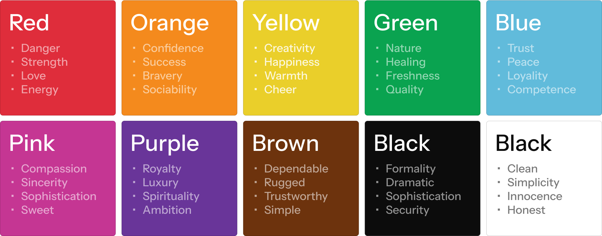
The psychology behind colors. Designed by me, adapted from here.


Recognizable Logo

The center of every brand is the logo. While many say logos have to be simple, I don't agree. In my opinion, a logo has to be recognizable. Take Starbucks', Versace's or Lindt's logo. These are very famous and successful brands with detailed logos, yet they are recognizable and, one might disagree, good.


Consistent Typography

There are millions of fonts available, but choosing the right one for your brand is crucial. The typography should be easy to read, reflect the personality of your brand, and be consistent across all platforms.

For my brand, I chose Instrument Sans. Its modern, sans-serif design underlines the clean and professional image I want to convey.


Concluding

I'm working hard to create a strong personal brand that reflects my values and vision. There will be a lot of improvements over time. You can track my progress and latest updates through the changelog.


Thanks for reading!